


Interiors Association member Emily Cunnane of InSpace offers her expert advice on how to add strong colours and patterns to your home…

Emily Cunnane
First, take a starting point. That could be a piece of art that you enjoy or even something you love from your own wardrobe. It should give you a hint about where to begin. Then, chose a fabric or tile or wallpaper in that colour to anchor the scheme. Paint can be bought at any stage in any colour. It’s much easier to find a paint colour to go with the sofa or the tiling than vice versa. If you start with the paint, you can end up limiting your choices. But the main thing is – don’t be afraid. Your home should be a joyful space. If you don’t like a colour, you can change it. It’s not a matter of life or death.
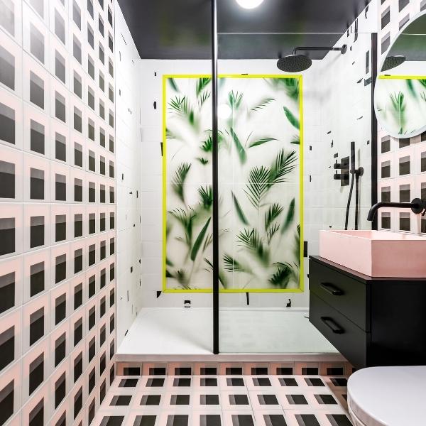
Mix and match patterns create an impact in the bathroom design by InSpace.
You don’t need loads of different colours. Just one will do! Choose a strong colour and then tone it down with textures and materials. We recently designed a family home in Fairview with a blue kitchen. It gives the impression of having a lot of colours, but actually, that blue is the only colour in the room. Everything else in that room is fairly minimal in white, oak and birch. The blue is also used in the living room rug, accessories and in artwork, but it’s all the same blue.
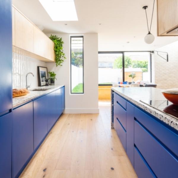
Farview family home with a blue kitchen designed by InSpace.
When you’re using strong colours and patterns together, make sure there is a common thread between them. You can achieve this by repeating elements of the design, something as simple as a blue trim that repeats from room to room can give cohesion to the interior and stop it from feeling disjointed. It also makes sense for expensive items to be made in natural materials. Because they stand the test of time and will combine well with anything, it allows you to go a bit madder with the colour. Try using colour in unexpected places. Another of our projects was home in Sandymount with a subtle dreamy palette interspersed with splashes of bright raspberry red. The living room sofa is red and we echoed that with two red alcoves in the shelving unit and a red inset bookcase for recipe books in the kitchen. You can also use wallpaper at the back of shelves or hidden in cabinetry to create a surprise when you open the door. In Sandymount, the floor is terrazzo tiling, but a rectangle of geometric patterned floor tiles in the dining area performs the visual function of a rug. The tiles are in the same muted palette as the kitchen and reappear again on the living room floor where they form a border to delineate the seating area. That’s the second thread of continuity in the overall design. The rooms are different but there are significant elements that carry through. Another trick is to mix patterns. That’s something that people can be wary of, but it works. Stripes and dots sit easily together, for example, or stars and stripes. That’s a pattern combination that everyone knows. One of the ways of combining them effectively is to contrast a geometric pattern with a floral one; or a simple pattern with a more intricate one. In the Sandymount project, we juxtaposed the red alcoves in the shelving unit and a red inset bookcase for recipe books in the kitchen. You can also use wallpaper at the back of shelves or hidden in cabinetry to create a surprise when you open the door. In Sandymount, the floor is terrazzo tiling, but a rectangle of geometric patterned floor tiles in the dining area performs the visual function of a rug. The tiles are in the same muted palette as the kitchen and reappear again on the living room floor where they form a border to delineate the seating area. That’s the second thread of continuity in the overall design. The rooms are different but there are significant elements that carry through. Another trick is to mix patterns. That’s something that people can be wary of, but it works. Stripes and dots sit easily together, for example, or stars and stripes. That’s a pattern combination that everyone knows. One of the ways of combining them effectively is to contrast a geometric pattern with a floral one; or a simple pattern with a more intricate one. In the Sandymount project, we juxtaposed the geometric tiling on the floor with a painterly floral fabric on the ottoman and cushions. Each pattern is completely different to the other, but both are in a similar palette and this brings continuity to the ensemble. Another way to combine patterns is to play with scale – try using one largescale pattern and introducing the same pattern on a small scale as an accent. If combining patterns is really not for you, consider combining different textures: rough with smooth; matt with shiny. Alternatively, you can throw caution to the winds and allow the patterns to clash, as we did in an early project in Inchicore where we deliberately chose mismatching wallpaper and woodwork and allowed them to fight it out. One of the reasons that worked so well was that the client had asked for something bright, colourful and ‘not too run of the mill’.
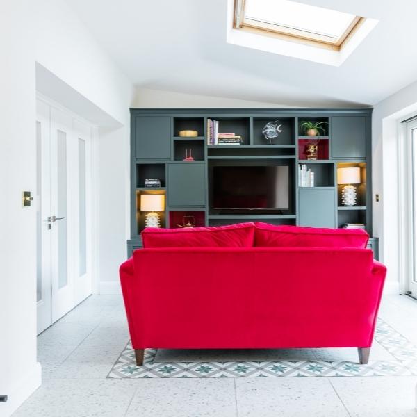
InSpace has used geometric tiles to delineate the seating area in this home in Sandymount.
If you’re cautious about going mad with colour and pattern, try using soft furnishings – rugs, cushions and tapestries – instead of paint. Hanging a rug on the wall will create an instant large-scale artwork (you can buy brackets on Etsy) and it has insulating properties as well.
It is colour, texture and pattern all in one! You can also bring in colour in appliances. One of the more colourful ranges from Rangemaster or a Smeg fridge would make a good centrepiece for a kitchen, but you can also bring colour in with smaller items like the Moccamaster coffee makers in yellow, red or orange from Moyee Coffee. For the bathroom, Adamsez produces cast concrete washbasins and roll-top baths with coloured exteriors that can be ordered in any colour you like.
And, finally, don’t forget about the fifth wall (also known as the ceiling). It’s often forgotten about but it can be papered, painted, or even tiled!
Professional, qualified members of the Interiors Association offer everything from one-off consultations to fully bespoke design schemes for every style and budget. For more information visit theinteriorsassociation.ie


